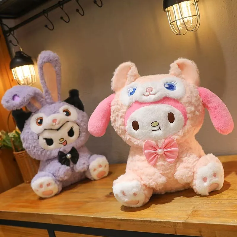
The purple Kuromi style acts as the hero SKU, while the pink My Melody version softens the range and broadens its gifting appeal. Together they form a clean purple-pink assortment that can scale from display-focused gift plush to child-friendly cuddle toy.
1. The purple Kuromi plush is clearly the hero SKU
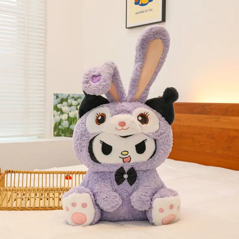
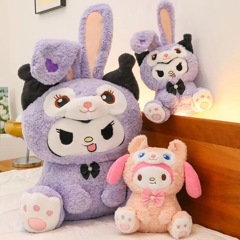
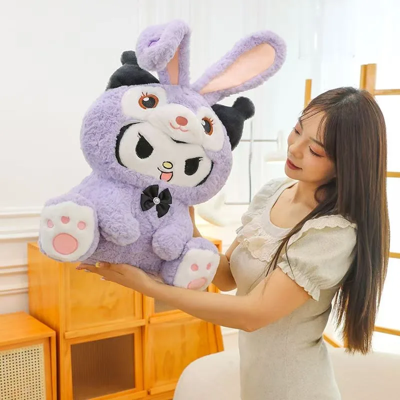
The large purple plush has the strongest silhouette in the set: tall upright ears, black side accents, a centered black bow, and wide paw pads facing forward. Those details make the toy readable even from a distance. This is the kind of hero piece that carries the photo set by itself, which is why the single-product image and the scale image both work so well.
Why the main plush works as a hero SKU
The tall ear line, rounded body, and front-facing paws give the purple plush a clear character silhouette that still feels soft enough to hug.
2. The pink My Melody companion makes the set feel complete
The smaller pink piece changes the mood of the collection immediately. It uses a softer peach-pink body, long pink ears, and a pink bow so the set does not become visually heavy. This is important in a multi-SKU plush program: one hero style gives presence, but the companion style is what makes the assortment feel giftable and collectible instead of repetitive.
3. Ultra-soft pile and PP cotton filling are part of the visible appeal
The fur reads as fluffy and slightly long-pile, the edges stay rounded, and the body does not collapse flat. Those cues support an ultra-soft plush story with full PP cotton filling. In practical terms, the fill looks substantial enough to hold the seated pose while still reading as pressure-relief, cuddle-friendly plush.
| Visible feature | Why it matters commercially |
|---|---|
| Long upright ears | Make the silhouette recognizable in listing thumbnails and store photos. |
| Dense plush pile | Signals softness and gift quality before the product is handled in person. |
| Rounded PP cotton body fill | Helps the plush hold shape across different sizes without looking empty. |
| Bow and paw-pad details | Add value cues that separate the toy from a more generic rabbit plush. |
4. The size range supports both hero gifts and companion SKUs
One of the strongest images is the size-reference shot with the large purple plush being held by a person. That immediately tells buyers this design can support a more oversized gift size, while the smaller seated versions work as companion SKUs. For a product launch article, that is much more useful than abstract size claims because the customer can see the scale relationship directly.
Why the oversized size supports gift positioning
The oversized size makes the gift positioning feel more tangible because buyers can judge the scale at a glance.
5. This collection fits gift, bedroom, and children-oriented display channels
The room-scene images make the intended use case feel warm and domestic instead of purely decorative. That helps buyers picture the product more clearly: children gift plush, character room decor, soft cuddle toy, or cute seasonal promotion piece. Teams that want to turn similar references into cleaner production specs should lock the target size range, embroidery details, fabric hand feel, and hero photography direction before moving into quotation or sampling.
- Use the large purple style as the hero image across listings and campaign banners.
- Keep the pink companion as the soft contrast SKU for gift bundles or duo sets.
- Preserve ear shape, bow placement, and face embroidery when scaling the design into different sizes.
- Show one lifestyle scene and one size-reference image in any sales sheet or product page.
The strongest commercial point is the assortment structure: a purple hero plush, a pink companion plush, and a believable multi-size range for gifting and display.